Blog
What Is Escort Website Design? Complete Beginner Guide!
By Emily Thompson, Content Writer Published Updated 29 min read
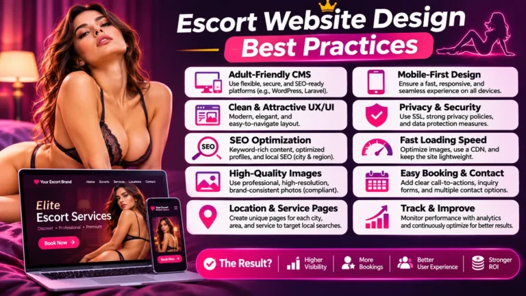
An escort agency website should make the business understandable, its information easy to explore and its enquiry process dependable. Start with a clear page structure, readable mobile layouts, accurate profiles and contact options that work. Add visual character around those essentials, then test the complete journey before approving the design.
For agency owners and adult-brand marketing teams, the difficult decisions are rarely about choosing between two attractive colours. They concern what a visitor needs to know, what the team can keep current and what happens when a page, image or form behaves unexpectedly. A design brief should answer those questions before the project becomes a collection of disconnected screens.
EMA approaches this topic from a marketing perspective: how the website presents the brand, supports discovery and gives people a clear next step. The following escort website design best practices apply to professional, non-explicit agency websites and directories. Adapt them to the actual business rather than copying a competitor’s page structure.
Begin with the jobs your website must perform
Define the website around a small set of visitor tasks and staff responsibilities. Someone arriving on the homepage needs orientation. Someone following a profile link needs accurate context. Someone submitting a question needs a reliable response path. Each of those tasks calls for a different design decision.
Write the intended journey in ordinary language. For example: understand the agency, explore relevant information, read an individual profile, check the enquiry process and contact the team. This is a planning sequence, not a rule that everyone must follow. People will enter through different pages and may revisit information several times.
Separate visitor needs from internal convenience. An agency may organise records by account manager, while visitors understand locations or profile names. The public navigation should use categories that help the visitor; staff can retain a different organisation inside the content management system.
Agree which action matters on each page. A profile may lead to an enquiry, while an explanatory page may lead to a relevant profile collection. Giving every section the same oversized contact banner makes the design repetitive and can interrupt someone who still needs information.
Before reviewing any mock-up, record:
- The main audience and the information they need.
- The page types required at launch.
- The action each page should support.
- The person responsible for keeping its facts current.
- The practical evidence needed to approve its design.
Use that list when a new feature is proposed. A feature earns its place by helping a defined task, not by appearing in another agency’s website.
Give every page type a clear purpose
Plan the homepage, profile collection, individual profile, location information and enquiry page separately. They can share a visual system without repeating the same content. A visitor should understand why a page exists and what useful detail it adds to the rest of the site.
The homepage introduces the agency and directs visitors towards the main areas. It does not need to carry every profile, every question and every location description. A concise introduction followed by meaningful routes into the site can be easier to maintain than a homepage assembled from all available content.
A collection page helps visitors understand and explore a set of records. An individual profile provides the approved detail about one record. An enquiry page explains how to contact the agency and what happens after submission. Avoid forcing these different purposes into one endlessly expanding gallery.
For larger sites, sketch the relationships between page types before designing individual screens. Decide where a location page leads, how a profile appears in more than one collection and where general agency information belongs. This prevents the same explanation being rewritten inconsistently across dozens of pages.
Give utility pages a deliberate home. Contact details, frequently asked questions and accessibility information should not become difficult to locate merely because they are less visually prominent than photographs. Use the footer for useful secondary navigation, while keeping the main visitor tasks accessible earlier.
A practical review question is: if this page disappeared, what useful information or route would be lost? If the answer is unclear, revise its purpose before adding more design elements.
Make the first screen informative
The opening screen should identify the agency, communicate its positioning and show a sensible route forward. It should remain understandable when a background image loads slowly or a visitor views the page on a narrow phone. Essential meaning belongs in readable text, not only inside artwork.
Choose a headline that describes the business accurately. A short supporting sentence can explain the audience or area served where that information is relevant and verified. Avoid filling the opening with interchangeable luxury adjectives that leave the visitor guessing what distinguishes the agency.
Select the hero image after deciding where the text will sit. Check both a wide crop and a portrait crop. A composition that works on a desktop may place the subject behind a mobile headline or remove the part of the image the agency approved for display.
Give the first screen one visually dominant action. A secondary action can serve visitors who need more information, but it should not compete through an identical colour, size and position. The distinction should reflect the page’s purpose rather than an arbitrary preference for brighter buttons.
Test the opening without animation. If the page only makes sense after several slides or a long transition, simplify it. A visitor should not have to wait for the correct message to appear in a rotating banner.
Keep the masthead proportionate. A large logo, several contact icons, a promotional strip and a tall navigation bar can consume the entire mobile screen before any useful page content appears. Evaluate them together, not as individually approved components.
Build navigation that stays predictable
Use familiar, descriptive labels and consistent navigation behaviour across the site. Visitors should be able to move between collections, profiles and agency information without learning a new menu on each page. The menu must work with touch and keyboard input as well as a mouse.
The W3C guidance on accessible menus provides a useful foundation for navigation structure and operation. Apply it to the actual menu, including dropdown controls and the visible indication of the current page, rather than judging accessibility from a static screenshot.
Avoid making the mobile menu a compressed copy of an oversized desktop navigation. Review which destinations deserve top-level placement and which can sit within clearly named groups. A menu with many nearly identical labels is difficult to scan even when it technically fits on the screen.
Check the complete opening and closing behaviour. The visitor should know whether a menu is open, be able to close it intentionally and return to the content without losing their place. A dropdown that disappears while someone moves towards an item is a functional defect, not a minor aesthetic issue.
Keep important links available outside the menu where context makes them useful. A location introduction can link to the relevant collection. An agency information page can link directly to the enquiry process. These contextual routes reduce dependence on repeatedly returning to the homepage.
Do not add empty social icons as decoration. Each active icon should lead to the approved account and have an understandable label. If a channel is not ready, leave it out of the public navigation until the business has a useful destination.
Design profile cards for comparison and orientation
Profile cards should make a collection easy to scan without turning it into a wall of competing badges. Use a consistent image shape, approved display name and a small number of relevant details. Reserve the fuller description for the individual page, where it can be read in context.
Choose the card fields from information the agency can maintain. A location field is only helpful if it is accurate. An availability label should not appear automatically because a template includes a convenient badge. When the source information is uncertain, design a neutral state instead of displaying a confident claim.
Keep the primary card action unambiguous. Decide whether the photograph, name and button lead to the same profile or perform different tasks. Several overlapping clickable areas can produce confusing behaviour, especially when a visitor is trying to scroll on a phone.
Write short descriptions that distinguish records meaningfully. Repeating the same promotional sentence underneath every image creates visual clutter without helping someone understand the collection. If no useful description is available, a simpler card may be a better starting point.
Plan for imperfect content. Test a long display name, an image that has not yet been approved and a record with an optional field left blank. The layout should remain orderly without stretching one card far beyond its neighbours or exposing internal placeholder text.
For directories, define the relationship between promotional placement and ordinary ordering. If a listing is sponsored, present that status clearly. Do not make a paid position look like an independent endorsement or an assessment the operator has not performed.
Make individual profile pages complete and maintainable
A profile page needs an approved introduction, a coherent image gallery, relevant public details and an appropriate contact route. Arrange those elements around the questions a visitor is likely to have. Keep personal or internal information out of the public template unless its publication has been expressly approved.
Use a repeatable structure while allowing the wording to remain individual. Consistent section placement helps visitors understand the page, but identical biographies make the site feel unfinished. The editor should be able to update the description without rebuilding the layout or changing another profile accidentally.
Distinguish agency-wide information from profile-specific facts. If the same enquiry process applies across the site, maintain a shared explanation and link to it where useful. Do not copy a long operational paragraph into every profile and rely on staff to update each version later.
Treat gallery order as an editorial choice. The opening image, supporting portraits and optional video should form a deliberate sequence. More media is not automatically more informative. Remove near-duplicates that add download weight without showing anything useful or different.
Provide a plan for inactive records. Decide whether a temporarily unavailable profile remains visible with an accurate explanation, leaves the collection or is retired. The right choice depends on the business, but the website should not leave the visitor facing unexplained broken links or misleading availability.
Before approving the template, ask an editor to make a routine change and preview the result. That short exercise can reveal whether the proposed design is workable for the people who will actually maintain it.
Treat mobile use as a complete journey
Mobile website design includes much more than fitting content into a smaller width. Review the journey from arrival to navigation, profile exploration and enquiry, using a real phone. Check whether fixed elements, the on-screen keyboard and browser controls interfere with the task at any point.
Google’s mobile-first indexing guidance explains that its indexing uses the mobile version of a site’s content. Keep important information available on mobile rather than deleting useful text solely to make a page look shorter. A different layout can still present equivalent content.
Use deliberate spacing around interactive controls. A row of tiny icons may look tidy in a desktop design file but be awkward to tap accurately. Check the actual control area, not just the size of the visible symbol. Leave sufficient separation between actions with different consequences.
Inspect fixed contact bars carefully. They can provide a useful route to the agency, but they should not obscure the last lines of a profile, cover a form error or sit on top of another floating widget. Review the combined effect of every persistent element.
Test at more than one narrow width. Include a long heading, enlarged text and a device orientation change. The layout should adapt without forcing the visitor to scroll sideways to read ordinary content or reach a button.
Finally, complete the journey over a mobile connection. The experience of a gallery, menu or enquiry form may differ from the designer’s fast office connection. Record the specific problem and affected device instead of relying on a general statement that the site is responsive.
Use galleries that are attractive and efficient
Select images for their purpose, prepare suitable versions and check how the gallery behaves before adding effects. A strong gallery should show the approved material clearly, preserve the intended crop and remain usable while images arrive. Its controls should never require the visitor to guess what is clickable.
The web.dev guide to responsive images explains why a single image size is not suitable for every display. Ask the developer how the site chooses an appropriate file for each layout. Check the delivered image, not just the dimensions of the original upload.
Separate the thumbnail and enlarged viewing experience. A small collection card does not need to download the same file as a full-screen view. At the same time, excessive compression can damage the presentation. Review realistic samples to find a workable balance for the actual photography.
Write alternative text according to the image’s function. The W3C images tutorial distinguishes informative, functional and decorative uses. Avoid treating every image description as a place to repeat search keywords. Use concise descriptions that help someone understand the relevant content or action.
Check the gallery’s less obvious states:
- A missing or unavailable image.
- The first and last image in the sequence.
- Opening and closing an enlarged view.
- Returning to the same position on the profile page.
- Keyboard access to the gallery controls.
Keep approved originals and public derivatives organised. Replacing a photograph should also trigger a check of its thumbnail, social preview and any reused card image, so the old version does not remain visible in unexpected places.
Make enquiry forms clear about the next step
An enquiry form should ask for the information the agency needs to respond and explain what submission does. It should not imply that an appointment is confirmed when the team still needs to review the request. Match the button label, confirmation message and staff workflow to the same process.
Start by deciding which fields are necessary for an initial conversation. A long form can be justified when each field has a clear purpose, but collecting information simply because a plugin supports it adds work for both visitors and staff. Keep optional questions visibly optional.
Follow the W3C guidance on form labels: identify each field clearly rather than relying on text that disappears as someone starts typing. Put short instructions beside the relevant question. A visitor should not need to search an unrelated paragraph to understand the required format.
Handle errors without blame. Explain what needs correcting, preserve valid information and keep the person near the affected field. The W3C guidance on form notifications covers feedback for both successful and unsuccessful submissions. Include those states in the design review rather than approving only an empty form.
Use a confirmation message that describes the next step accurately. If response times vary, do not promise an immediate reply. If a separate team handles a particular type of enquiry, route it deliberately and explain any relevant distinction without exposing internal staff details.
Test the inbox as well as the webpage. A polished success message is not enough if the notification never reaches the responsible person. Submit a clearly marked test enquiry, verify receipt and check what happens when delivery fails.
Build trust through specific, supportable information
A credible website explains the business clearly and keeps its information consistent. Use accurate agency details, transparent processes and approved imagery. Avoid replacing missing evidence with decorative claims such as “number one”, “verified” or “trusted by thousands” when the business cannot support those statements.
The strongest trust content often answers practical questions. Who handles enquiries? Which contact channels are monitored? How can someone correct inaccurate information? What does a particular status label mean? Plain explanations can be more useful than another row of generic shield icons.
Publish testimonials only when their use is authorised and their presentation is accurate. Do not create composite customer quotations or attach a stock portrait that implies it depicts the speaker. If suitable testimonials are unavailable, use a clear explanation of the service process instead of inventing social proof.
Treat partner logos and accreditation marks with the same care. Their appearance can imply a relationship or approval. Include them only when the relationship exists and the agency is entitled to display the mark in that context. A visually impressive logo strip should not create an unsupported impression.
Discretion also depends on the interface. Review public filenames, contact addresses, image backgrounds and link previews for information that was not intended for publication. Use fictional customer details during demonstrations, and keep real enquiry content out of design presentations.
If the existing site feels inconsistent, request a free SEO and visibility review to identify which content and navigation issues deserve attention before commissioning a complete redesign. A focused correction may solve the underlying problem without replacing every page.
Why generic AI content can fail escort websites
Generic AI copy can leave an escort website polished but uninformative. Repeated descriptions do little to explain an individual profile, the agency’s actual approach or what happens after an enquiry. When the wording could belong to almost any business, it weakens the clarity that the design is meant to create.
The practical risks deserve an editorial check:
- Invented details: a draft may add availability, locations, experience or response promises that nobody approved.
- Interchangeable profiles: changing a name while reusing the same flattering biography gives visitors little useful distinction.
- Forced keywords: repeating location and service phrases can interrupt the description and make cards harder to scan.
- Missing answers: long introductions can still omit who handles enquiries or which information a visitor should provide.
For example, a fictional profile described as “available worldwide at any time” creates a specific expectation. If the approved record only supports travel by prior arrangement, replace the generated promise with that accurate information. A human editor needs the underlying facts to make the correction; a more elaborate prompt cannot establish availability.
Google’s guidance on generative AI content recognises useful research and structuring applications, while warning about generating many pages without adding value. It also calls for manual accuracy checks. Saying AI content never helps would therefore be misleading.
Hire adult content writers to turn approved business information into clear, individual profiles and useful agency pages, with factual review before publication. Keep private customer messages and sensitive profile information out of drafting prompts. The publishing standard should be useful, accurate content with a clear owner, whether the first draft came from a person or a tool.
Create a visual system the team can sustain
Choose typography, colours, spacing and reusable components as a connected system. The aim is a recognisable brand that remains readable across page types. Avoid deciding every section independently, because small inconsistencies accumulate as editors add profiles, announcements and location information.
Start with body text. It should be comfortable to read against the chosen background, with enough spacing to distinguish paragraphs and headings. Decorative typography can work selectively, but long descriptions and form labels should not depend on ornate letterforms or faint colour differences.
Define the appearance of links, primary buttons and secondary actions. A visitor should be able to distinguish an action from ordinary text. The W3C design tips address contrast, interaction cues and consistent presentation. Use those principles when reviewing the actual colour combinations rather than approving a palette in isolation.
Build components around real content lengths. A profile introduction, a location explanation and a short announcement do not always need the same card layout. Give each component a purpose and specify what happens when optional content is missing.
Keep animation restrained and purposeful. A transition can explain that a menu opened or a gallery changed. Motion added to every heading and image may distract from reading and complicate the experience. Ask what an effect communicates before approving it.
Record the decisions in a brief style reference for editors. Include an approved heading pattern, button examples, image proportions and a sample page. This helps later additions look intentional without making every small update depend on the original designer.
Plan speed around real pages and interactions
Performance work should cover the page someone actually uses, not only a nearly empty homepage. Test a media-heavy profile, a collection with filters and the enquiry journey. Identify the slow element before prescribing a plugin, a new host or a complete rebuild.
The Core Web Vitals overview distinguishes loading performance, responsiveness and visual stability. These describe different aspects of the experience. A page can show its first content quickly but still react slowly to a menu tap or shift while images load.
For the main opening image, ask how early the browser discovers and requests it. The Largest Contentful Paint guidance explains why delaying important content can undermine loading performance. Do not apply the same loading treatment indiscriminately to the first image and every photograph lower on the page.
Reserve space for media and late-arriving components. The layout-shift guidance explains the importance of image dimensions and stable layout. Inspect whether a visitor could tap the wrong control because a banner or photograph moves the page beneath their finger.
Review scripts by purpose. A gallery, analytics package, chat widget and animation library may each seem reasonable on its own, but their combined effect matters. Remove abandoned features and ask who owns the remaining integrations. Performance should be part of routine maintenance, not a one-time launch badge.
Keep laboratory tests and observed visitor data distinct. Use diagnostic tools to investigate problems and available field data to understand actual experience. A single successful test does not establish that every device, page or visitor has the same result.
Connect the design to an understandable search structure
Search-friendly design gives important pages a stable identity, meaningful text and useful links. Start with the information architecture rather than adding keywords after the layouts are finished. Each page should explain a distinct subject that belongs within the agency’s actual offering and public information.
Use descriptive page titles and headings that reflect the content. A profile, a collection and an agency information page should not all share the same generic title. Keep the wording readable; repeating a search phrase in every component can make the page less useful without explaining anything new.
Google’s link guidance recommends crawlable links and meaningful anchor text. Ensure important profile and collection destinations are represented by actual links, rather than relying entirely on script-driven behaviour that obscures their destination.
Give location pages a reason to exist beyond changing a city name. Describe the actual scope and connect the page to relevant information maintained by the agency. Do not imply a staffed office, permanent presence or local experience that the business has not established.
Coordinate these decisions with the wider escort SEO strategy. Design and search work should agree on which pages matter, how they connect and what information each one needs. Neither team should discover the other’s requirements only after the website is ready to launch.
A redesign is also a chance to remove confusing duplication. Before merging pages, check their purpose and existing usage. Keep useful distinctions where they serve different needs, and avoid preserving weak pages simply because they have always appeared in the menu.
Choose features according to the size of the catalogue
A small agency and a large directory do not need identical browsing tools. Add search, filters and sorting only when they help someone explore the available information. Every feature introduces states that the team must design, test and maintain, including empty results and records with incomplete fields.
For a compact collection, clear cards and a simple page structure may be sufficient. A large filter panel can occupy more space than the records it is meant to organise. Start with the actual catalogue and the questions visitors ask rather than copying a large directory’s interface.
For a broader directory, choose filters tied to accurate, consistently maintained fields. Show which filters are active and provide an obvious way to clear them. A zero-results message should explain the situation and offer a useful adjustment without pretending that matching records exist.
Consider what happens after someone opens a profile and returns to the collection. Preserve useful context, such as the selected filter or browsing position, where the implementation supports it. Forcing the visitor to repeat the same choices makes comparison unnecessarily difficult.
Be deliberate about sorting. Labels such as “recommended” need a defined meaning. If the order is alphabetical, recent or paid, use wording that accurately describes it. Do not disguise a commercial ordering decision as an independent quality assessment.
Test performance and editing effort with a representative number of records. A design that works with a few carefully prepared examples may behave differently when the collection contains longer names, missing optional fields and a mixture of image proportions.
Choose a CMS that supports the design
The CMS should let the team maintain the website you have planned. Compare editing tasks before choosing a theme: updating a biography, replacing gallery images, changing shared information and publishing a new page. The following examples illustrate possible configurations, not a claim that one platform suits every escort business.
Self-hosted WordPress for an agency website. WordPress provides pages, posts, media management and editorial roles, with themes and plugins extending the design. An illustrative agency build could use structured profile records and a shared profile template, with location collections and an enquiry form configured around them. Those agency-specific features require development or suitable extensions; they are not a complete directory system supplied by default. Ask an editor to change one profile and verify its card, page and gallery before accepting the setup. Assign responsibility for hosting, updates and backups.
Squarespace for a compact independent website. Its portfolio tools offer editable layouts and contact forms. For a small, non-explicit presentation site, a proposed structure might include an introduction, about page, gallery and enquiry information. Compare that modest scope with the single-identity structure discussed in the Kessary example; this is not a claim about Kessary’s CMS. Check the provider’s current content and service requirements before committing, and test any filters or integrations you need rather than assuming a portfolio template includes them.
A custom CMS for a directory with specific workflows. Consider a tailored build when the brief requires listing submissions, staff approval, multi-location records or unusual relationships that standard configurations cannot support cleanly. Specify those functions explicitly: “custom” does not mean they already exist. Require an editing demonstration, documented maintenance responsibilities and an export of representative records. A distinctive visual design alone does not justify building a new publishing system.
For a broader comparison of editing, SEO controls, maintenance and migration, read our guide to the best CMS for adult websites.
Apply the page-purpose principle: Kessary as a real example
Kessary’s website provides a useful example of positioning a single independent companion rather than presenting an agency roster. Its homepage explains that enquiries are handled personally and that the business does not represent other companions. For a designer, that distinction changes the information architecture: a multi-profile directory structure would not match the business described.
The homepage provides links labelled About Me, Booking, Gallery and Experiences. These destinations illustrate distinct visitor questions: who is behind the website, what information supports an enquiry, where can visitors view photographs, and what contexts does the business describe? Its FAQ also addresses independence and how to initiate contact.
The transferable lesson is to organise pages around the actual operating model. An independent website can centre one identity and a direct contact route. An agency needs to explain its team and profile relationships. A directory needs to make listing ownership and browsing choices understandable. Similar photography does not make those structures interchangeable. Keep these responsibilities visible in the project brief.
For your own design review, turn those distinctions into practical tasks:
- Ask a new reader to explain the business after reading the introduction.
- Check whether page labels help that reader choose a sensible next destination.
- Review whether the contact instructions match whoever actually handles enquiries.
- Test the journey on a phone, including returning from a secondary page.
Treat the observed page structure as a reference for your brief. Performance, accessibility and enquiry delivery still need separate testing on the website being built. Clear wording provides a starting point; the completed interface must support it through working navigation, readable layouts and maintainable content.
Protect useful pages during a redesign
A visual redesign should not accidentally erase working content, break established links or disconnect forms. Inventory existing pages and important journeys before changing templates. Decide what stays, what changes and who will verify the result. Treat migration as part of the design project rather than an afterthought.
Keep useful addresses unchanged where practical. When an address must change, map it to the appropriate replacement. Google’s site-move guidance explains redirect planning and warns against irrelevant destinations. Sending every retired profile or information page to the homepage is not a meaningful mapping strategy.
Check content as well as visual appearance after transfer. A gallery can look complete while captions are missing; a form can appear correct while notifications go to an old address. Compare representative pages against the approved content and test their connected actions.
Record changes made during the transition. If staff keep editing the old site while the new version is prepared, decide how those updates will reach the launch copy. Otherwise, a corrected profile may become outdated again as soon as the new design goes live.
Define a release decision and a recovery route. The team should know who can pause launch if a critical journey fails and who can restore the previous working configuration. Avoid making several unrelated infrastructure changes at the same moment unless the project genuinely requires them.
After launch, revisit the important incoming links and search destinations. Confirm that the new pages answer the same relevant needs or provide an intentional replacement, rather than assuming that a successful homepage load proves the migration is complete.
Approve the site with a practical launch checklist
Approve the website through demonstrated tasks, content checks and named responsibilities. A design sign-off should cover more than colour and photography. Keep a short record of what was tested, what failed, what was corrected and which items remain outside the launch scope.
Review at least these areas:
- The homepage identifies the business and presents a clear next step.
- Menus and contextual links reach the intended pages.
- Profile cards and individual pages show approved information.
- Galleries work with touch and keyboard controls.
- Forms explain errors, preserve useful input and deliver test enquiries.
- Mobile layouts remain readable with the keyboard open and text enlarged.
- Page titles, internal links and changed addresses have been checked.
- Staff can perform routine edits without damaging the layout.
Separate defects from preferences. An unreadable label, incorrect contact destination or missing profile description needs a specific correction. A preference for a slightly different shade belongs in a different discussion and should not distract from a broken journey.
When comparing suppliers, ask to see comparable work and understand their role in it. The EMA portfolio can support that conversation, but any portfolio should be assessed alongside the proposed scope, maintenance arrangements and the tasks your own site needs to support.
Leave the launch with a clear owner for content, design components, integrations and performance follow-up. The website will change as the agency changes. A maintainable design includes the ability to make those ordinary changes accurately, not just an attractive presentation on the day it launches.
Measure improvements without inventing results
Judge a redesign against the problems it was intended to solve. Record the release date, the pages affected and the changes made. Then compare relevant observations over a sensible period, recognising that traffic sources, campaigns, staffing and seasonal demand may also change.
Keep website actions distinct. Opening a contact link, successfully submitting a form and receiving a relevant enquiry are different events. A click on a messaging icon does not prove that a conversation happened, and a submitted form does not establish a completed business outcome.
Ask the team handling enquiries which repeated questions suggest missing information. If visitors regularly ask how to contact the correct department, the website may need a clearer route. Use aggregated themes for content improvements rather than copying private messages into analytics reports or presentation slides.
Review performance by page type where the available data permits it. A homepage improvement can coexist with a slow profile template or a confusing collection page. Grouping everything into one average may hide the part of the site that most needs attention.
Make small, explainable changes after launch. If the team changes navigation, photography, campaign targeting and enquiry handling simultaneously, it becomes difficult to understand what influenced the result. A written change log supports a more honest interpretation than attributing every later improvement to the redesign.
Use findings to maintain the site. Correct stale information, simplify an unclear interaction and investigate broken deliveries promptly. The aim is a website that continues to serve the business well, supported by observations rather than promises attached to a design style.
Turn the design brief into a usable website
A successful brief connects brand presentation with practical tasks: finding information, understanding a profile, sending an enquiry and keeping the content current. Start with those tasks, choose a coherent visual system and test the important journeys before launch. For help identifying priorities in an existing website, request a free website visibility review and share the pages or interactions that are causing difficulty.
Frequently asked questions
It presents accurate agency information, makes profiles easy to explore and provides a dependable enquiry route. The layout should work on mobile, support accessible interaction and be manageable for staff. Judge those qualities through real tasks with fictional test data rather than the appearance of a homepage alone.
Choose according to the required page types, brand presentation and maintenance needs. A carefully configured template may suit a straightforward site, while unusual content relationships or interactions may need custom work. Ask suppliers to demonstrate the proposed implementation rather than assuming either approach is automatically superior.
Use enough approved images to present the profile clearly without repeating nearly identical material. There is no universal number that fits every site. Review the gallery’s purpose, download behaviour, image quality and mobile controls, then remove photographs that add weight without useful information.
Make contact easy to find, but adapt the prominence to the page’s purpose. A profile may need a clear enquiry action, while an information page may first direct readers towards relevant details. Repeating several competing buttons in every section can make the journey harder to follow.
A redesign can address technical and content problems, but it does not guarantee better rankings. Preserve useful content and addresses, review mobile presentation and monitor the implementation after launch. Interpret later search changes alongside other activity rather than treating the design launch as proof of causation.
Prepare the page requirements, approved brand assets, public profile information and the intended enquiry process. Identify who can approve facts and who will maintain the website. Representative content is more useful than polished placeholder text because it exposes the real lengths, fields and image choices the design must accommodate.
Emily Thompson
Content Writer
Writes EMA’s adult SEO and escort marketing coverage, working from the accounts the team runs. Commercial detail in every engagement stays under NDA.